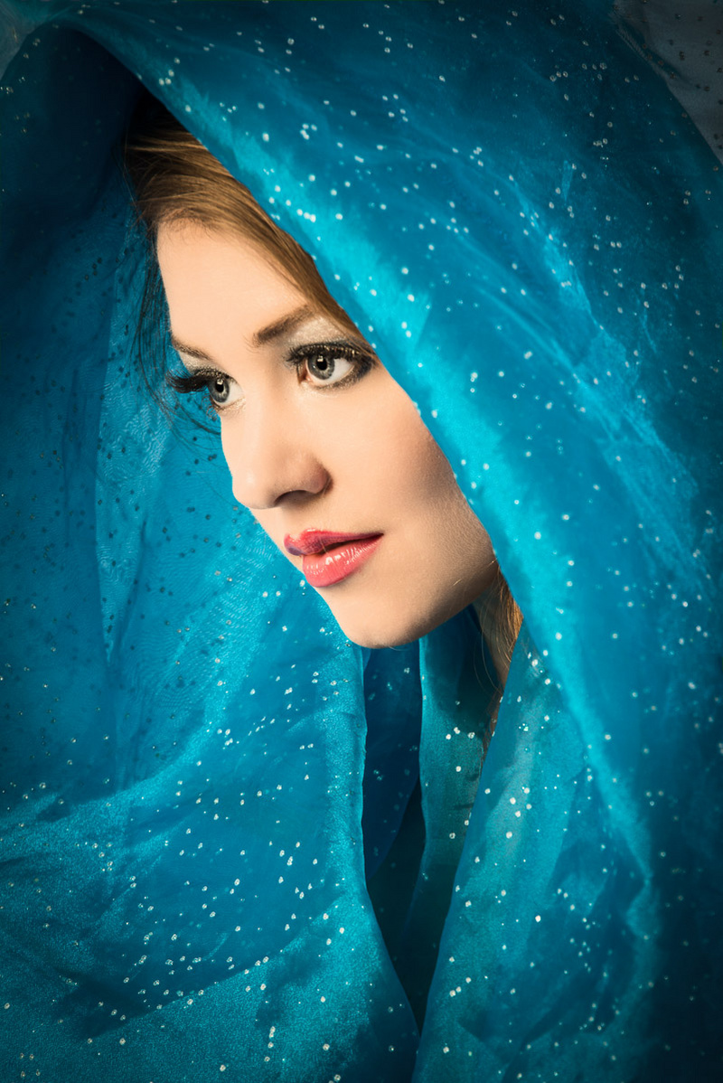
March 13, 2014 12:20pm I hope you don't mind comments that are longer than one word. This is one of the most perfectly lit and composed portraits I have ever seen! It could easily be on a magazine cover or in an art gallery. Perfect short lighting with soft directional light, the light falling off on the edges, the face being the brightest object and the area of highest contrast. The diagonal and graceful curves created by the scarf and her head, the way her face is framed, the way the color complements and contrasts with her face. Her eyes are located according to the rule of thirds, they are pointing in the same direction as the nose, you show just enough of the far eye and cheek so that the tip of the nose doesn't extend beyond the line of the face. These are all little details that print judges look at, and you nailed them all! I can't find a single detail that could be improved - outstanding job!